
Shortly after the website went live, the first travel inquiries started coming in - a quick sign that the brand resonated with the right people.
LOGO DESIGN
The logo keeps things soft, friendly, and personal – just like Michalina herself. Instead of going in a typical “travel agency” direction, I focused on creating something that feels close, human, and welcoming.
The rounded forms and gentle typography reflect care and openness, while the overall simplicity makes the brand feel easy to trust. It’s not about selling trips - it’s about inviting someone into a safe, well-organized experience on the other side of the world.
↑ Website
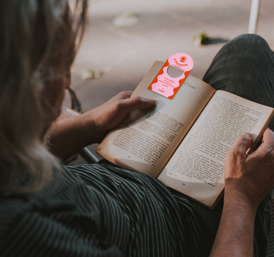
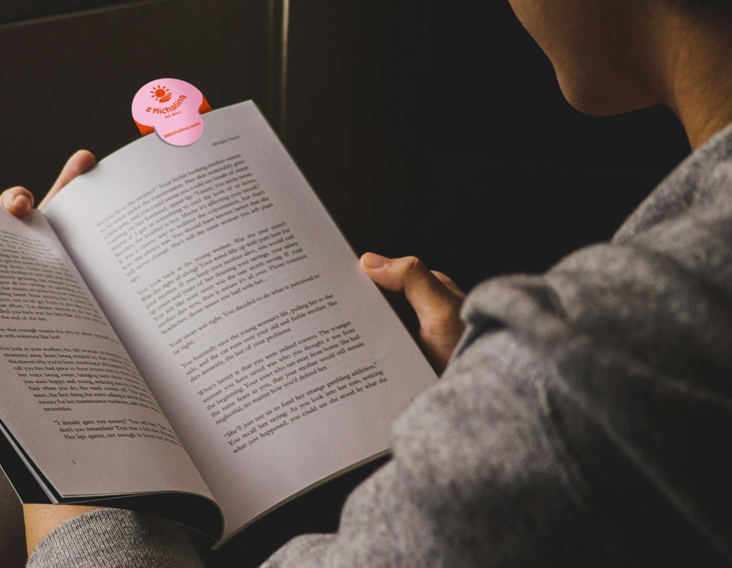
BRAND IDENTITY
The visual identity builds on that sense of warmth and connection. Natural colors, soft contrasts, and calm compositions create a feeling of ease and safety – something especially important for people traveling far from home.
Photography plays a key role here - showing not just Bali, but the experience of being taken care of. The whole brand feels personal and grounded, balancing professionalism with a relaxed, human touch.
This branding creates a space where traveling doesn’t feel overwhelming, but instead - supported, simple, and genuinely enjoyable.
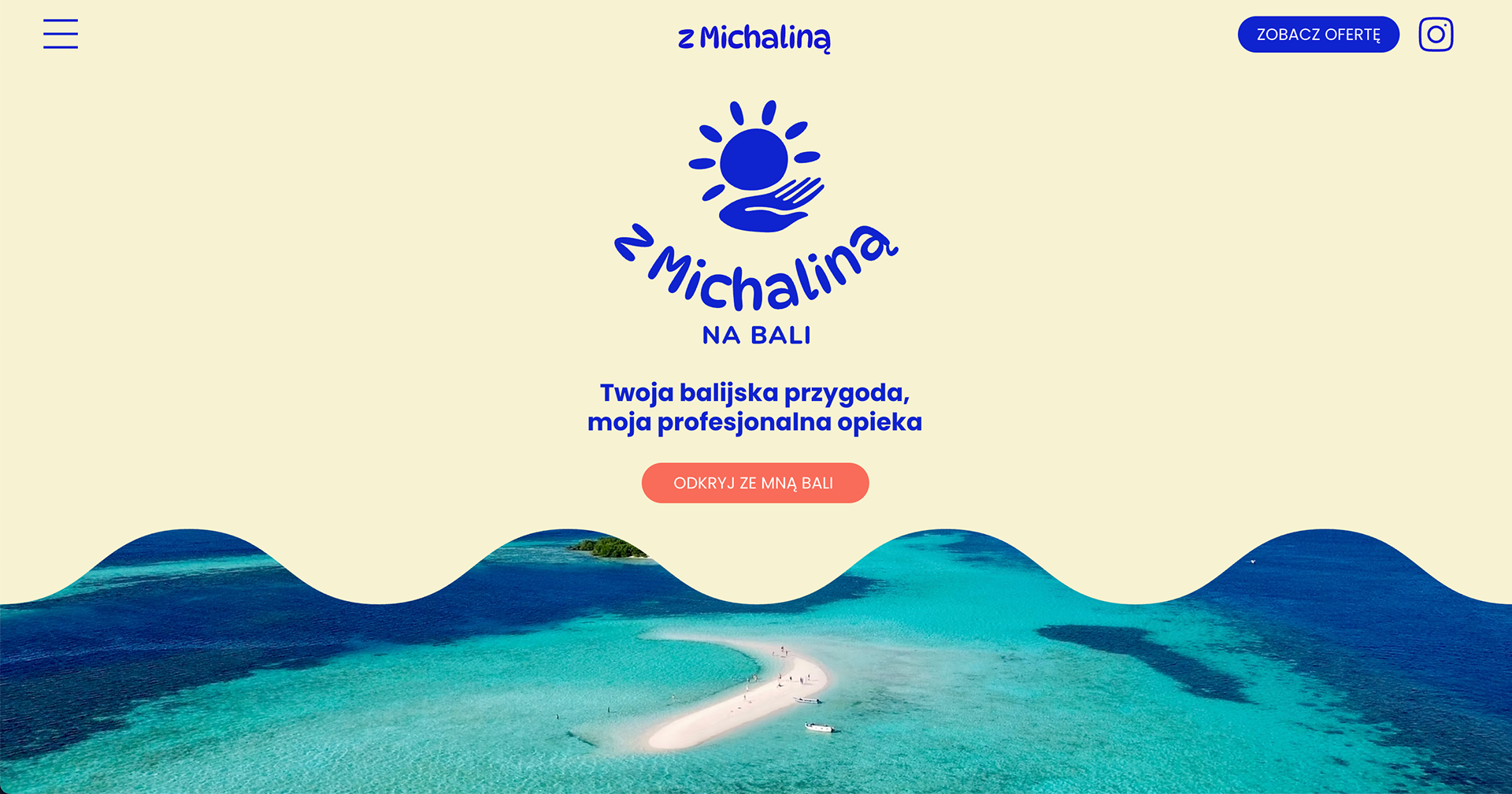
WEBSITE DESIGN
The website was designed to guide users step by step, making the whole process feel clear and stress-free.
It presents different travel options in a simple way, while the needs form helps personalize each trip and makes the first contact easy and natural. The tone of the website combines professionalism with warmth – showing that behind the offer there is a real person ready to take care of everything.
Two taglines support this communication:
Your Balinese adventure, my professional care – focused on trust and organization,
and Bali isn’t far when someone is waiting for you there – building a more emotional connection.
and Bali isn’t far when someone is waiting for you there – building a more emotional connection.
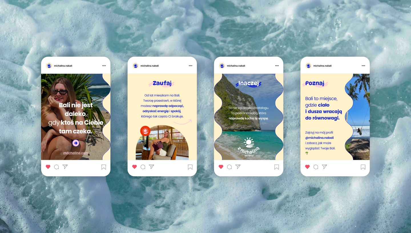
SOCIAL MEDIA GRAPHICS
Below are selected templates for social media communication, designed to keep everything consistent, clear, and easy to use.
This project is already live and helping turn interest into real travel experiences ✈️
The brand is now live and growing – welcoming new travelers to Bali every month 🌴
🧘
You can explore the website and follow the journey on Michalina's Instagram: