
LOGO DESIGN
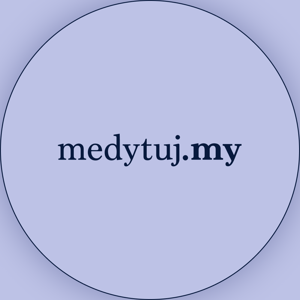
The medytuj.my logo keeps things beautifully simple - just like mindfulness itself! I went with a clean serif font that feels both trustworthy and timeless, then added a subtle circular highlight around ".my" to draw attention to that personal invitation in "medytujmy" (let's meditate together). It's a small detail, but it transforms the whole logo from just text into a warm welcome.
The calm, toned color palette feels perfectly meditative - clean, peaceful, and uncluttered. The typography captures what mindfulness is all about: accessible on the surface but deeply meaningful when you dive in.
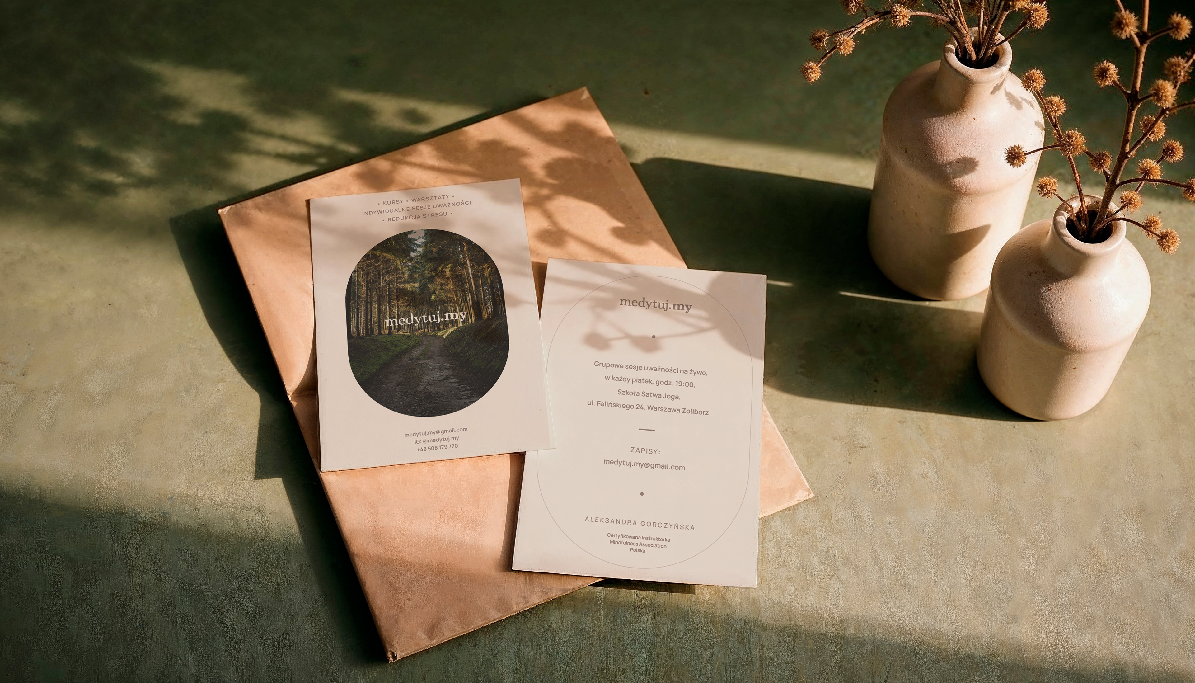
↑ Promotional postcard design
BRAND IDENTITY
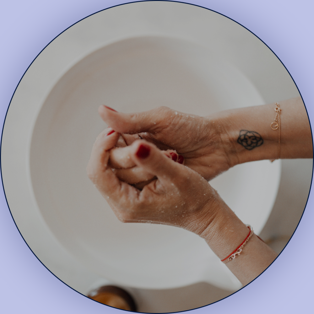
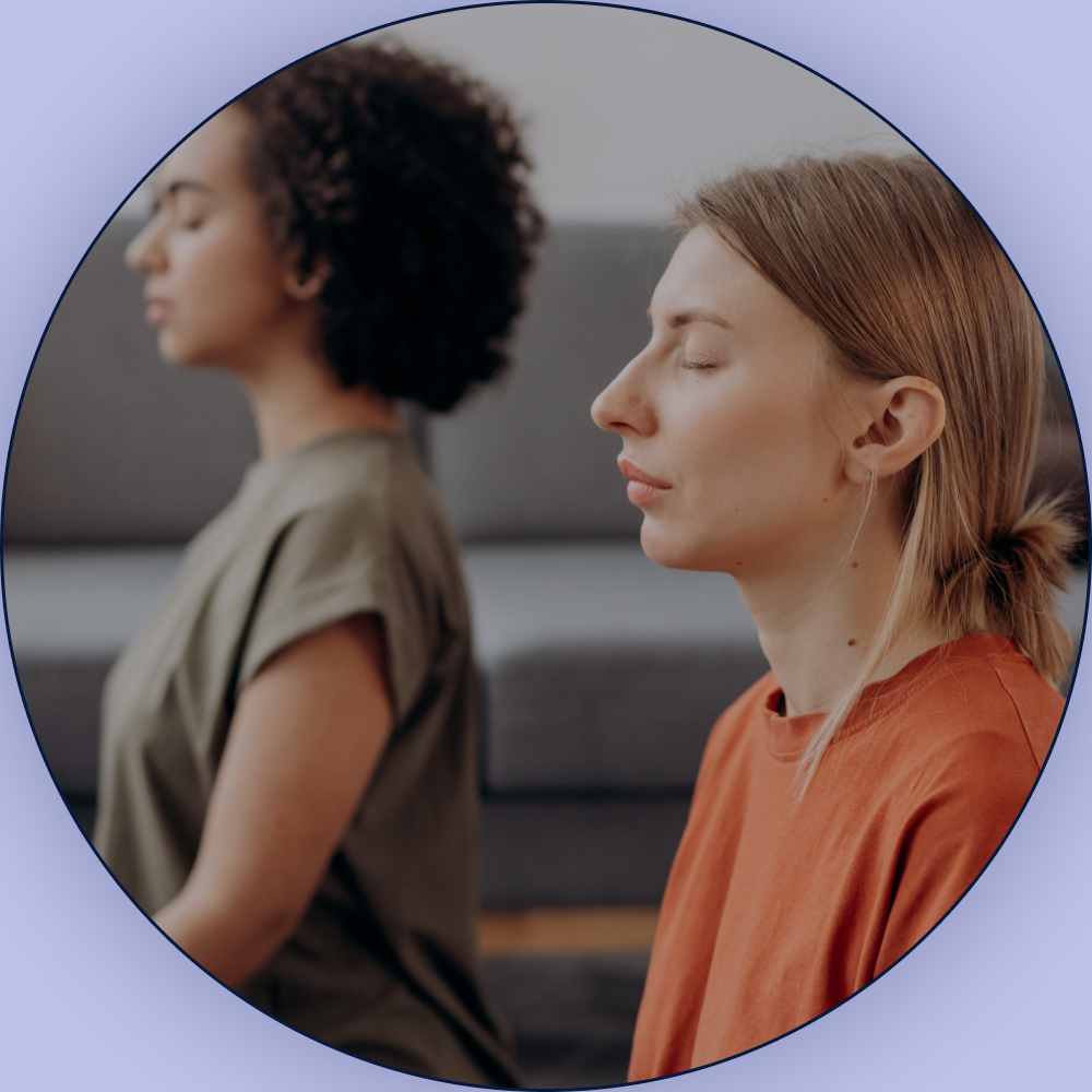
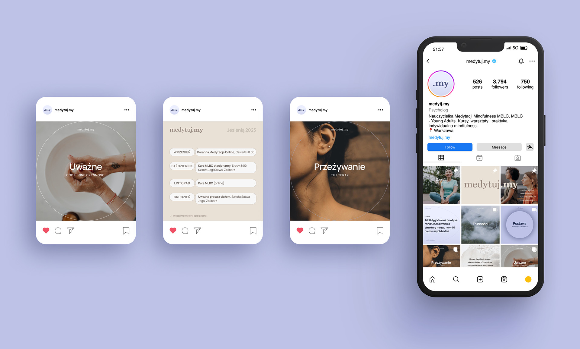
The visual identity takes that same welcoming philosophy and runs with it! The Instagram feed brings together soft, peaceful photography with natural textures and gentle lighting - the kind of imagery that makes you want to take a deep breath just looking at it. Everything flows together through those calming, muted colors that instantly say "time to relax."
I love using circular shapes throughout the branding because they represent wholeness and that inner balance we're all searching for. The whole design feels effortlessly organized - kind of like how mindfulness helps organize the beautiful chaos in our minds.
This branding creates a visual sanctuary where busy people can feel invited to just pause, breathe, and reconnect with themselves in our crazy, overwhelming world.
SOCIAL MEDIA GRAPHICS
Below are social media post templates, including: research articles on mindfulness, challenges in mindfulness practice, mindfulness quotes, schedule/timetable, events/workshops, gallery cover with text.
This project is a work in progress - currently focusing on the web design, so more exciting stuff coming soon!
🧘
So stay tuned and learn more about mindfulness on Instagram: